Resources·
Free dark UI illustrations for SaaS websites (2026)
Where to find free dark-mode and glowing UI illustrations for feature pages, changelogs and blog covers, compared honestly: styles, licences, formats and editing.
Loris·6 min
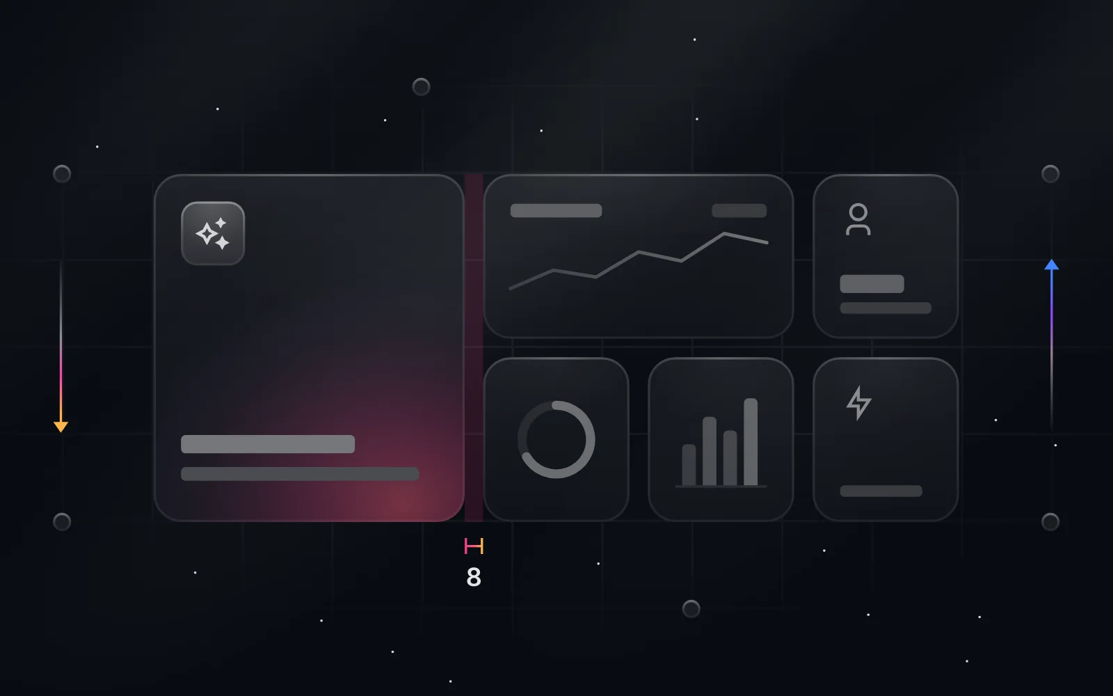
Short answer: most free illustration libraries are character art (unDraw, Storyset) or 3D isometric (Flowbite, Icons8). For dark, glowing UI scenes, the look many SaaS sites use on feature pages, the free options are Duskcover (999 editable scenes, SVG, PNG, WebP, video and React export), Flowbite Illustrations (54+ MIT-licensed 3D SVGs with dark variants), Icons8's Glow style (free PNG with a link back, SVG on a paid plan), or building the look yourself in Figma.
If you've looked at the feature pages of developer tools lately, you've seen the style: a dark background, one soft light source, a UI fragment drawn in glass and thin lines, maybe a coloured accent. People often call it the "Linear look", after the product that made it popular. It's hard to find free, because the free libraries grew up around a different style.
We made Duskcover because we kept drawing these scenes by hand for our own work. This page lists every free option we know of, including ours, with the trade-offs.
What counts as a dark UI illustration?
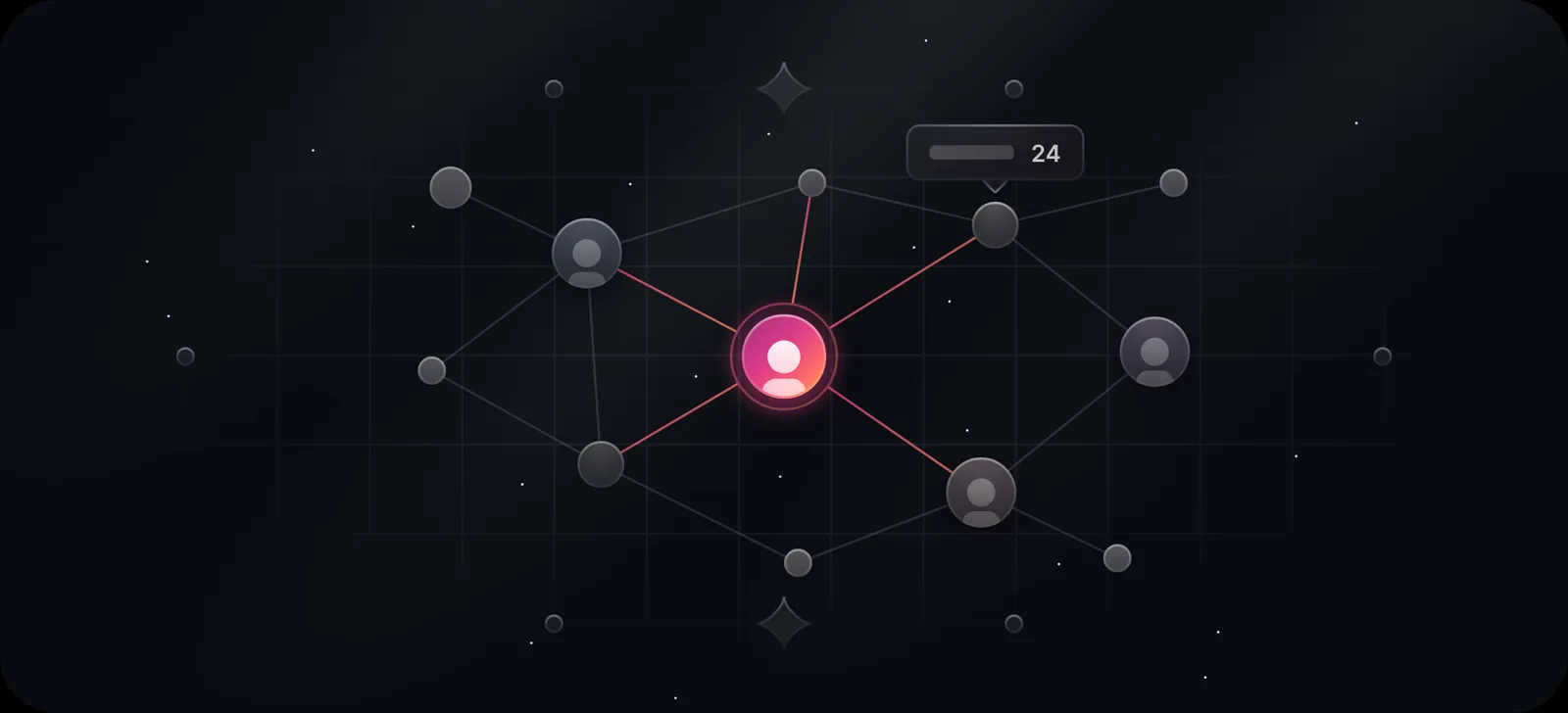
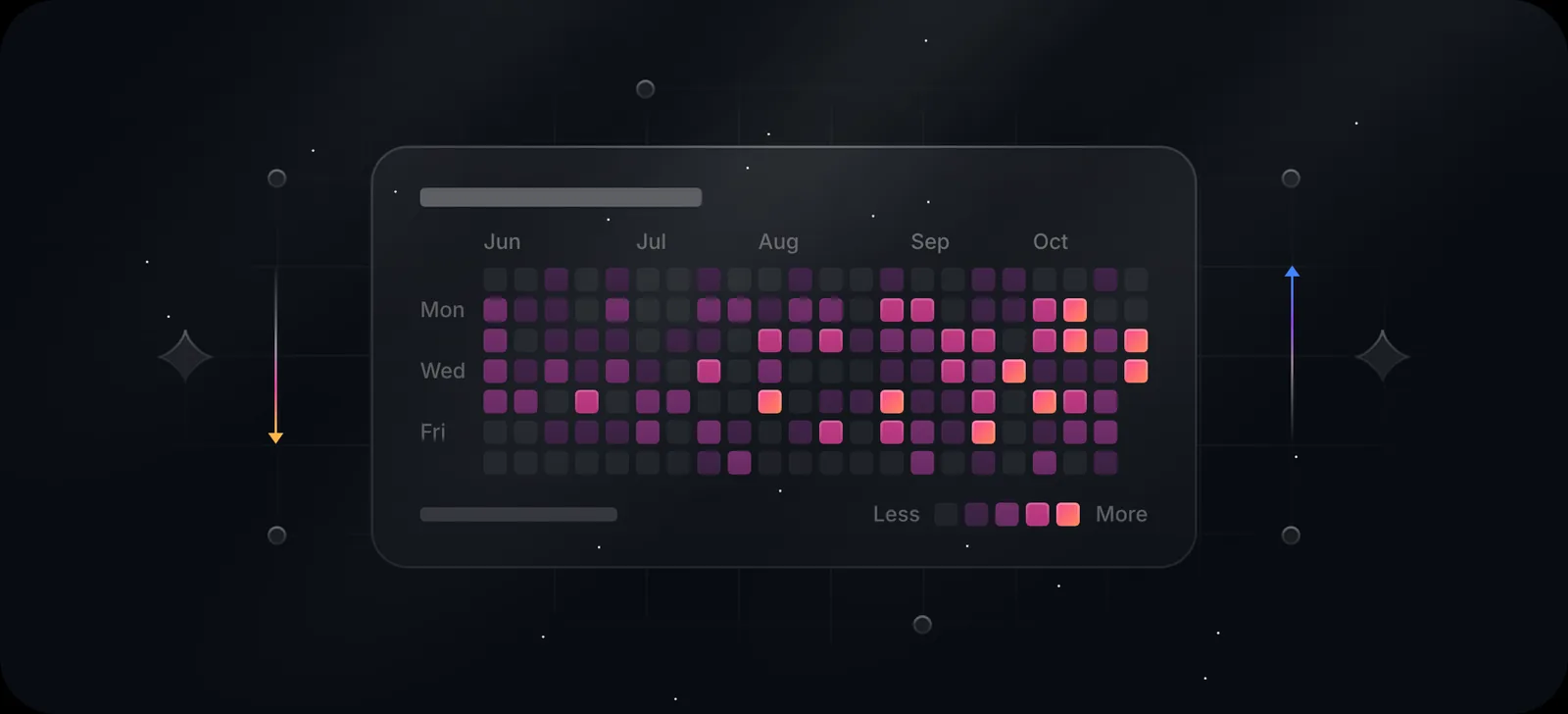
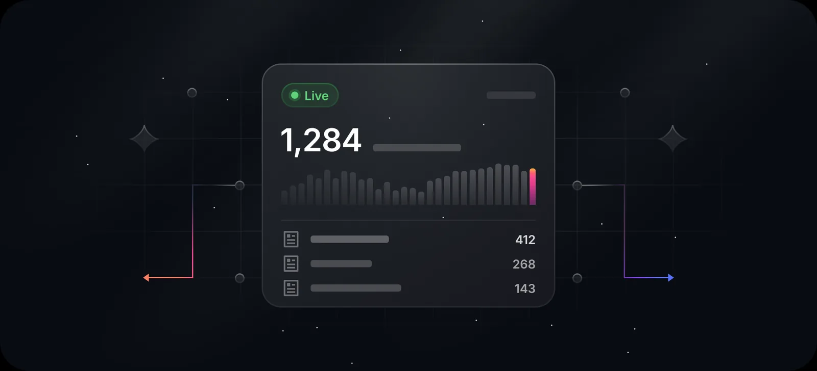
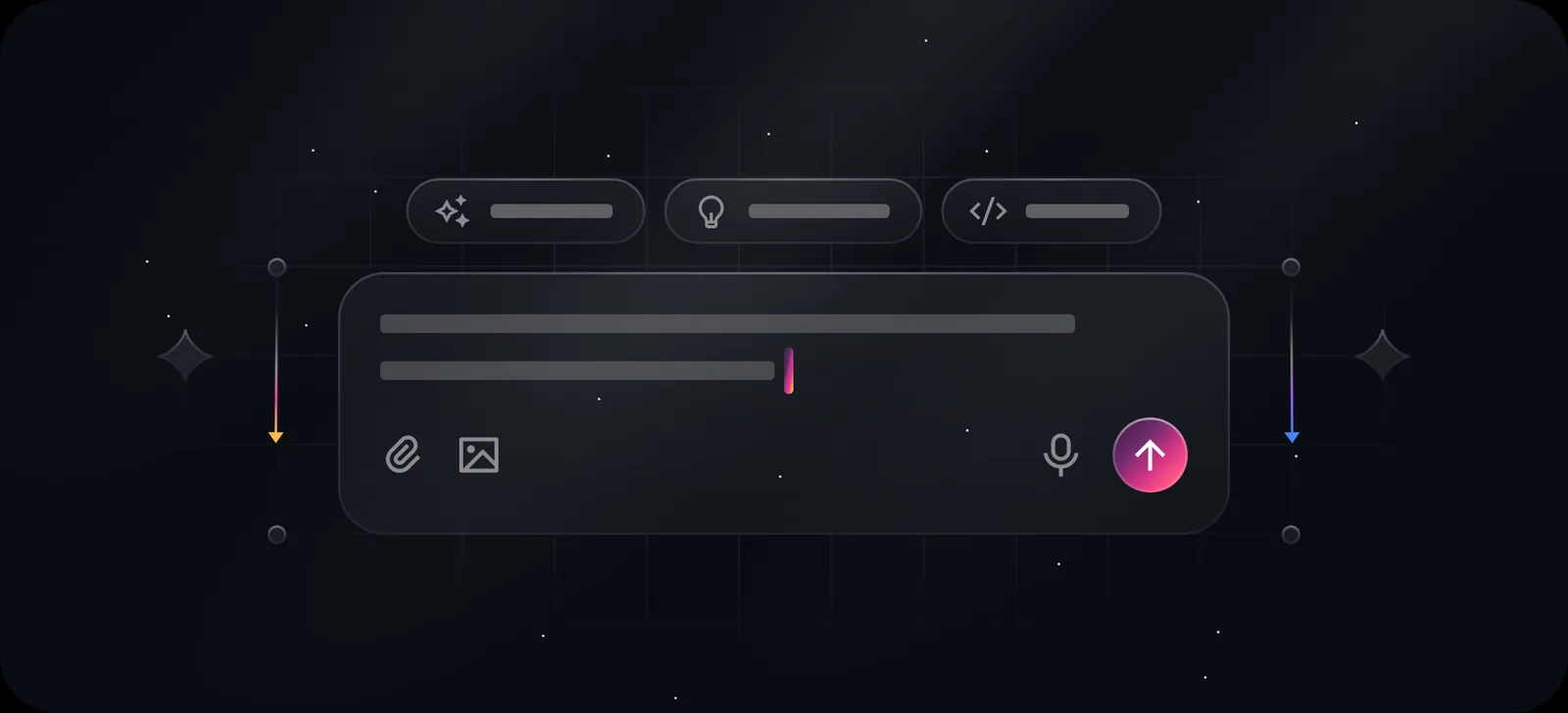
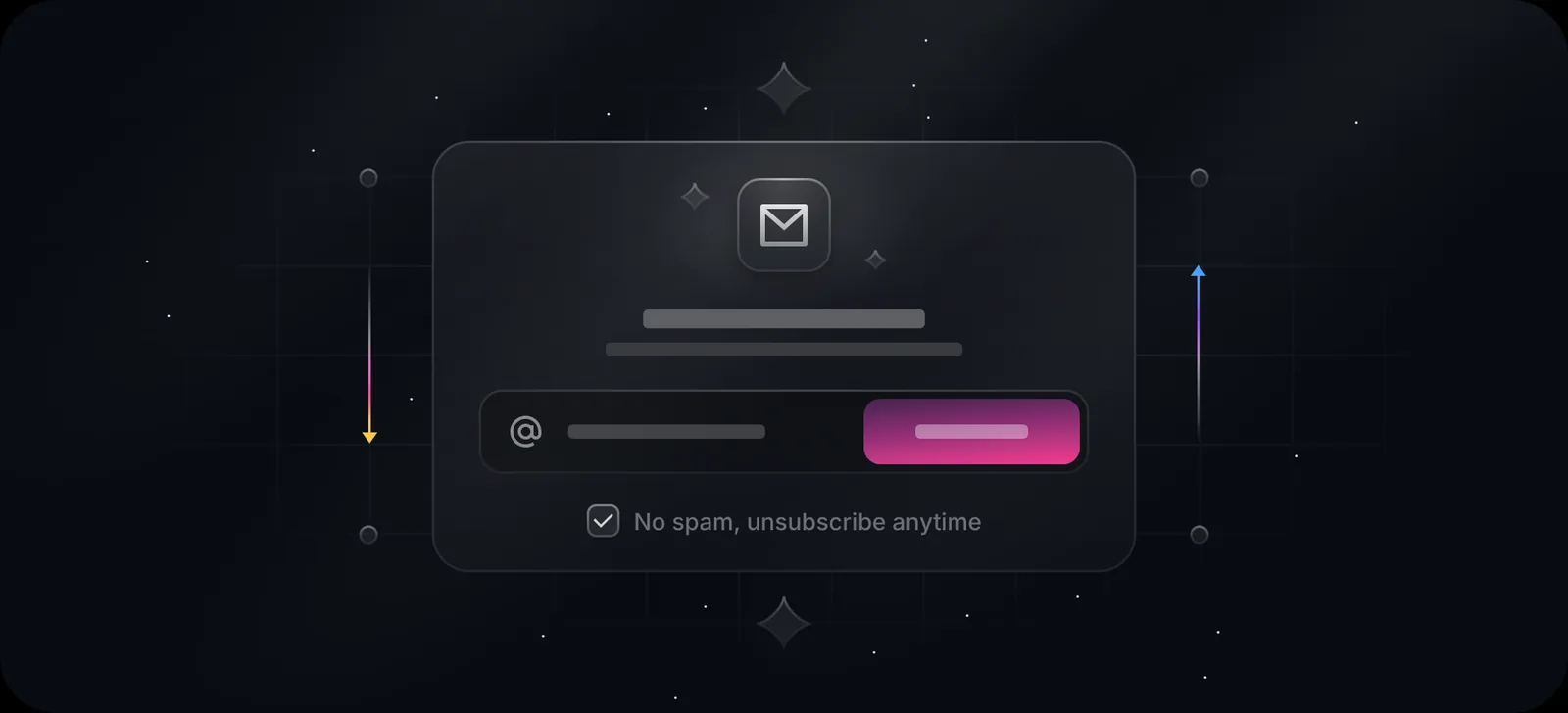
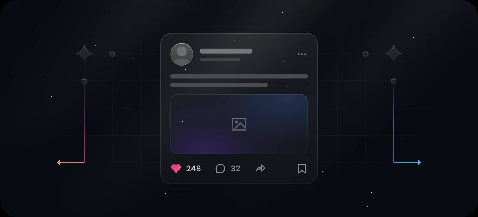
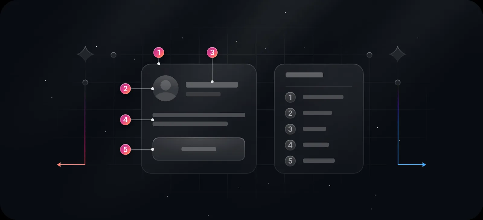
An illustration that shows a product idea through interface pieces (a card, a chart, a toggle, a terminal) on a dark background, lit rather than flat. It sits between a screenshot and a character illustration. It explains a feature without showing your real UI, so it doesn't go out of date when the UI changes.
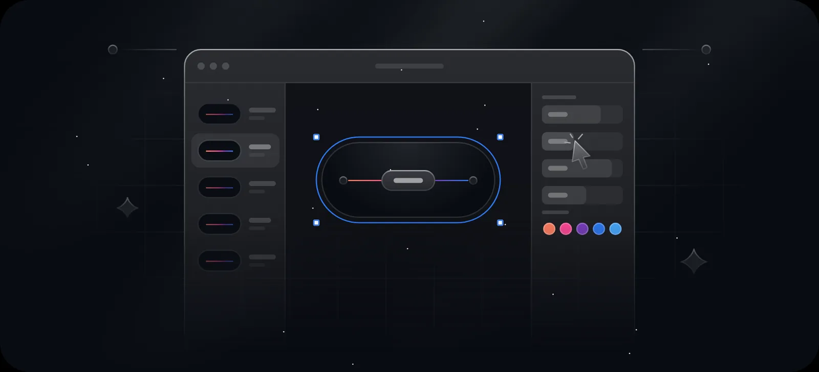
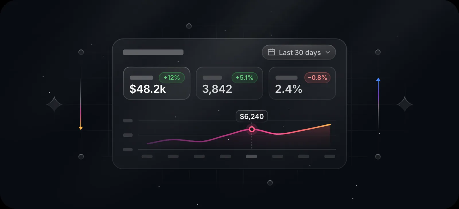
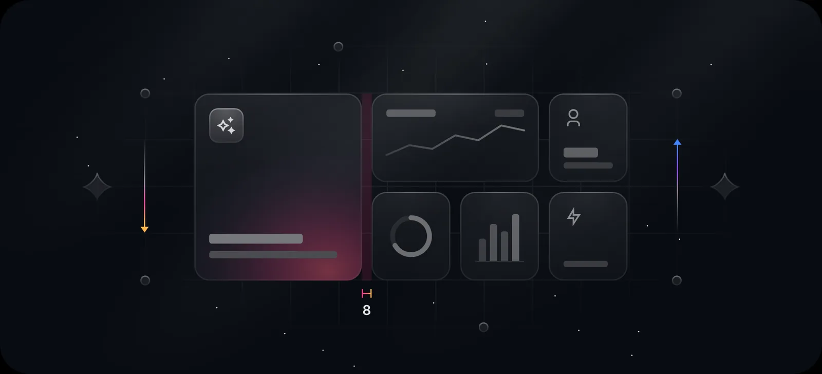
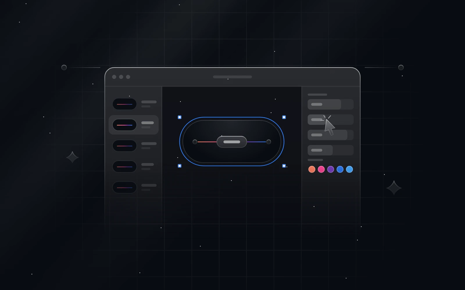
Here's a sample from Duskcover's Library, at full resolution. Click any picture to open it larger.
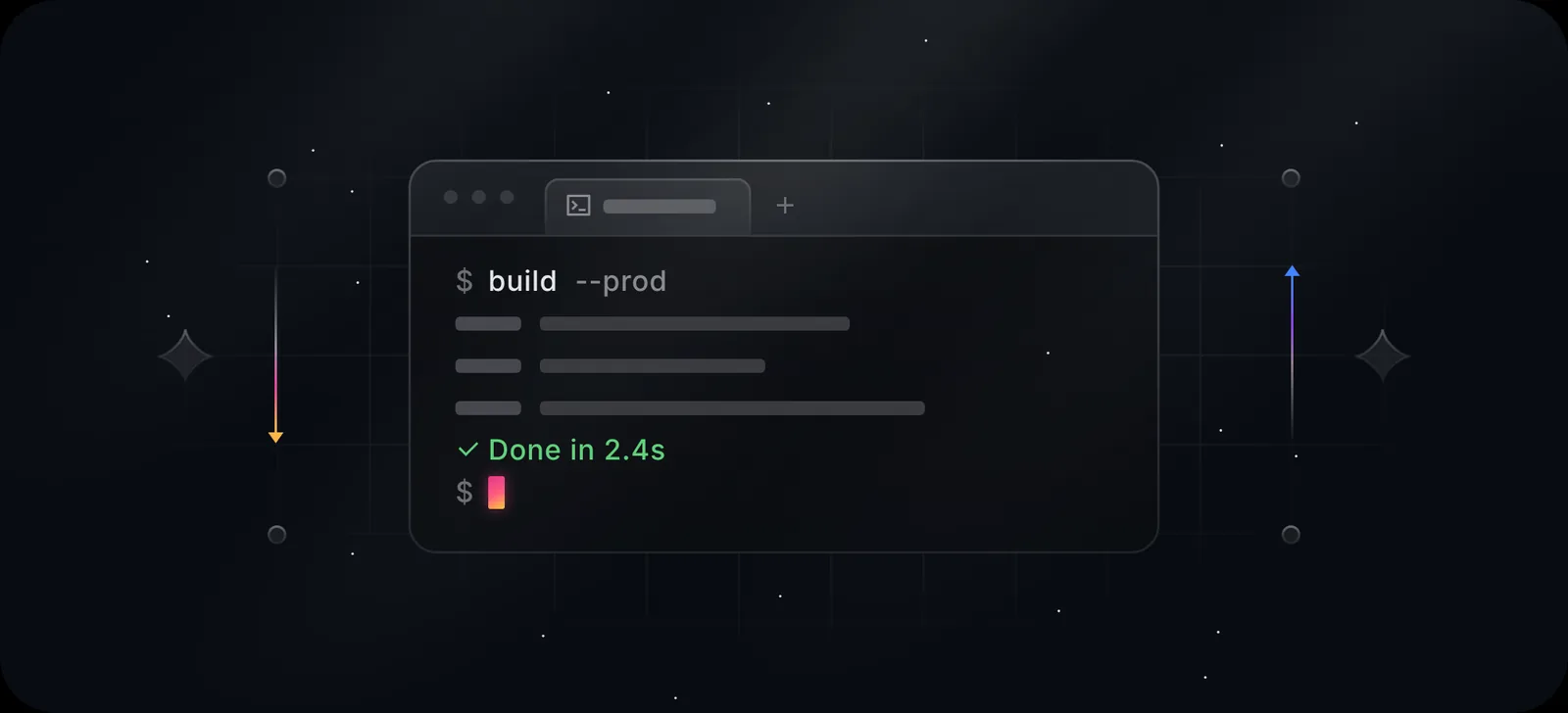
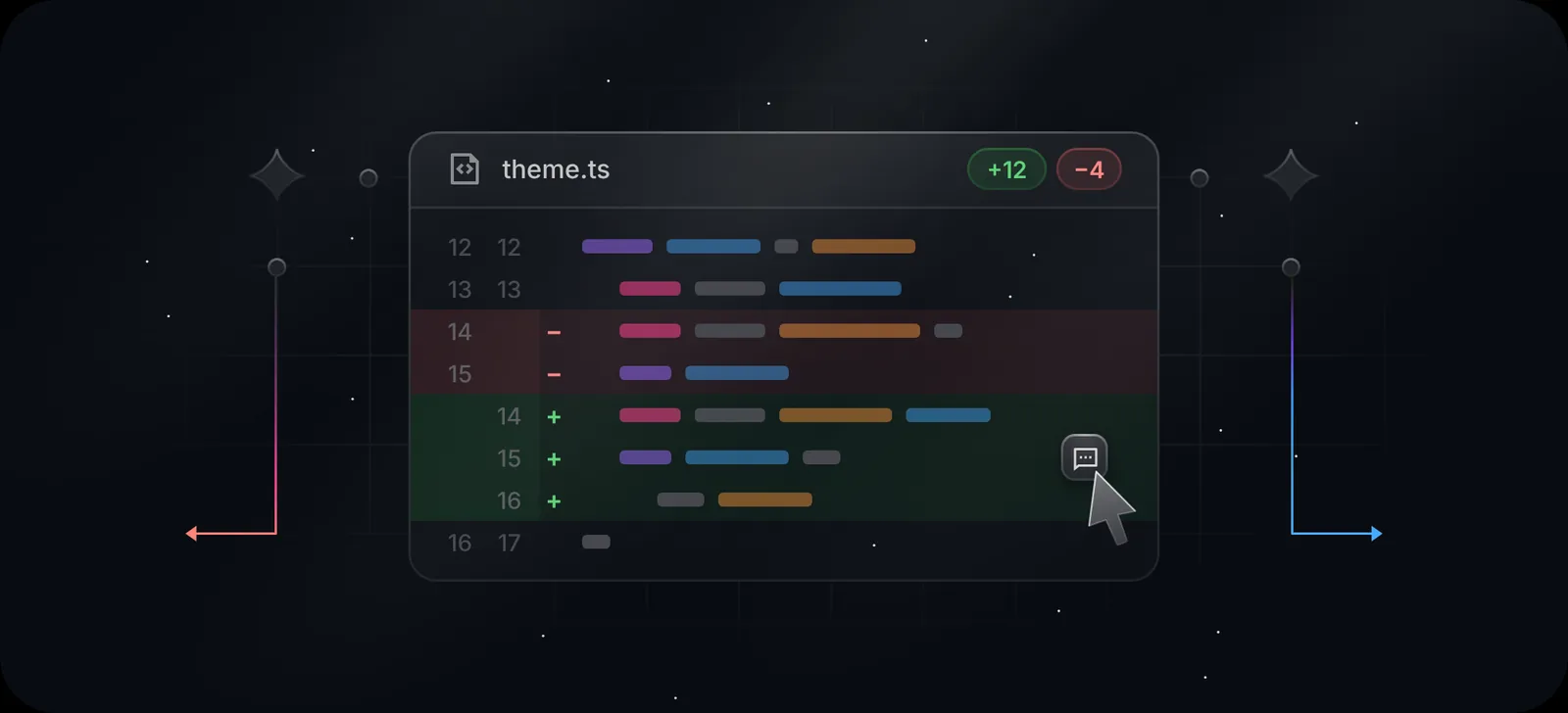
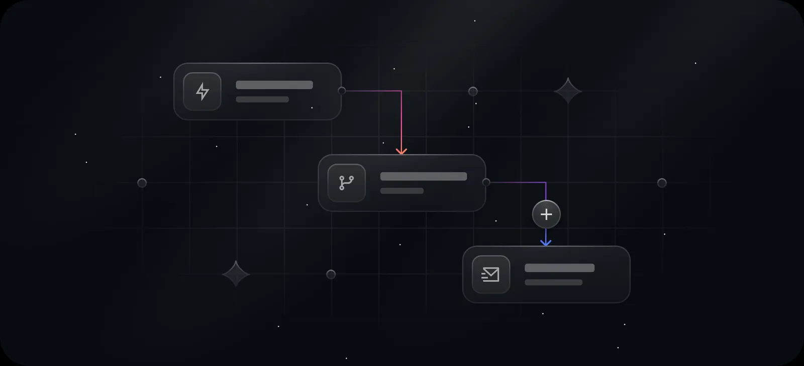
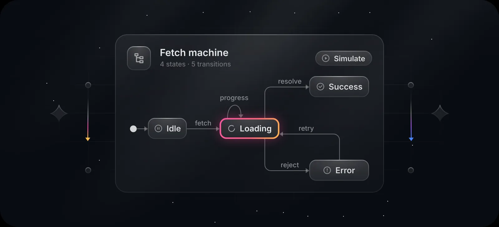
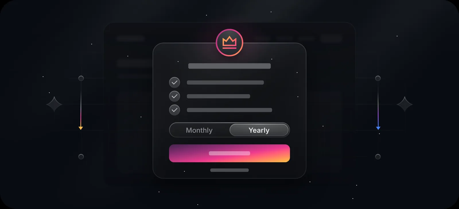
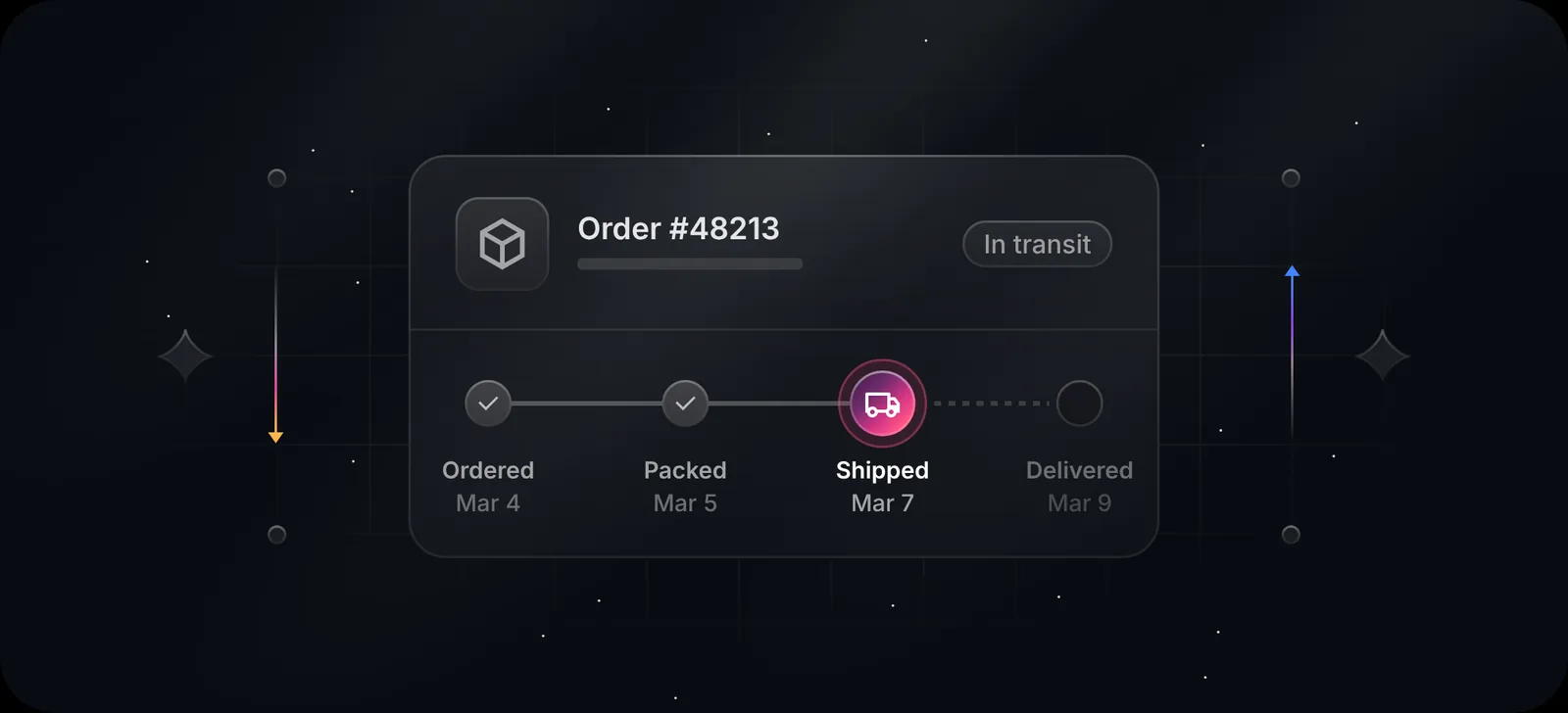
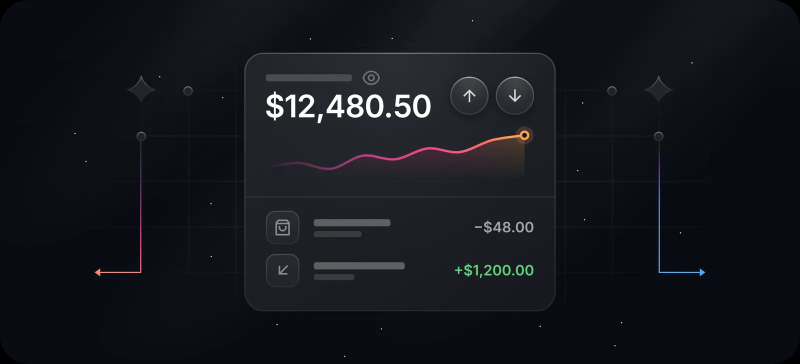
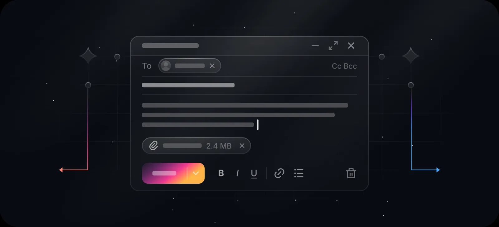
The free options, compared
| Style | Free licence terms | Formats | Edit text and colour | |
|---|---|---|---|---|
| Duskcover | Dark, glowing UI scenes (999) | Free for commercial use, no credit (licence) | SVG, PNG, WebP, MP4/WebM, React | Yes, in the browser |
| Flowbite Illustrations | 3D objects, light and dark variant (54+) | MIT | SVG | Colours in code or Figma |
| Icons8 Glow | Neon, flat | PNG free with a link back; SVG on a paid plan | PNG, SVG | Recolour on site |
| unDraw | Flat characters | Free, no credit needed | SVG, PNG | One accent colour |
| Storyset | Characters, some animated | Free with a credit line | SVG, PNG, animated | Colours on site |
| DIY in Figma | Whatever you draw | Yours | Anything | Yes, slowly |
Licence details are taken from each project's pages and the sources linked in this post as of November 2026. Check them again before you ship, because they change.
When to pick which
- You want the Linear-style look and don't want to draw it. Duskcover. Of the free options we found, it's the only one built around dark UI scenes, and the only one that exports video and React components.
- You want one consistent 3D set in light and dark. Flowbite Illustrations. It's MIT, so there's no credit line, and every piece has a dark variant.
- You want people in your illustrations. unDraw or Storyset. Dark UI scenes deliberately leave people out.
- You need exactly your product's UI. Draw it in Figma from real components. It takes longer, but nobody can tell it's not your product, because it is.
One scene, eight colour themes
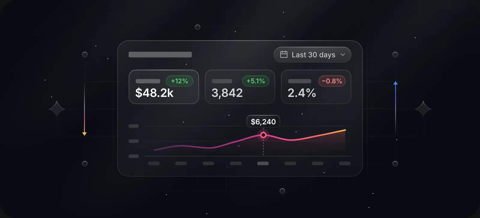
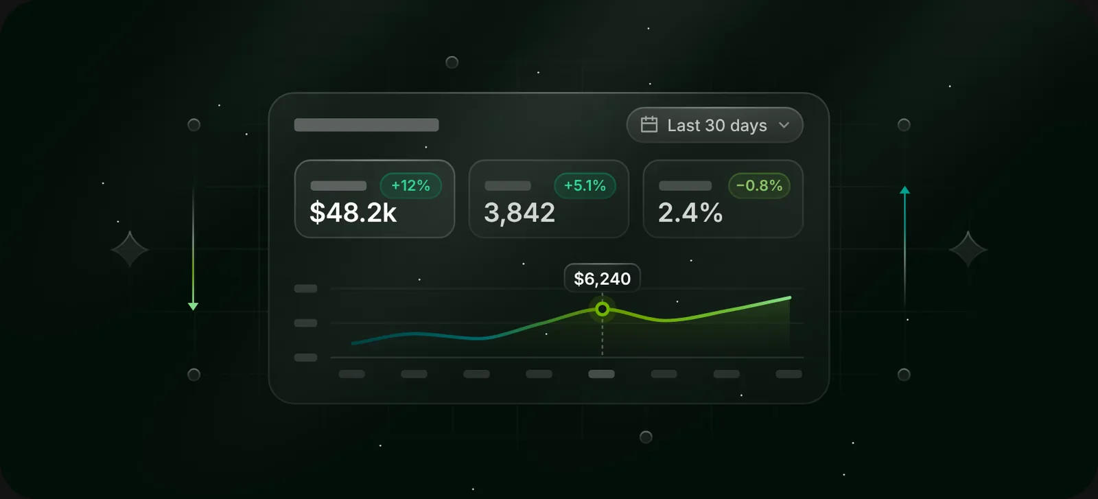
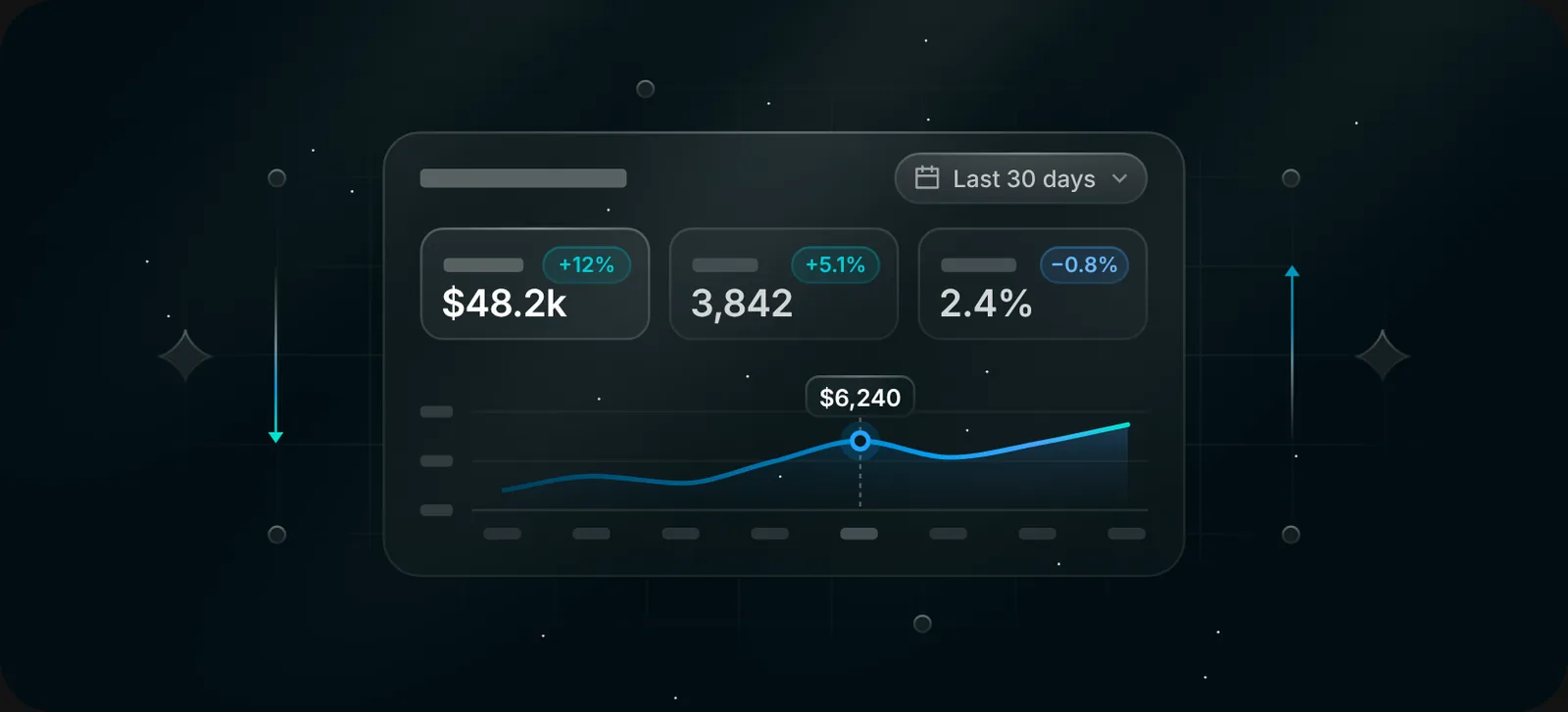
The thing that makes a library useful for a real product is matching your brand. Duskcover's Design panel recolours every accent in a scene in one click: Original, Azure, Violet, Rose, Amber, Emerald, Cyan, or a custom colour. The background, light and grid stay the same, so a whole set still looks like one family.
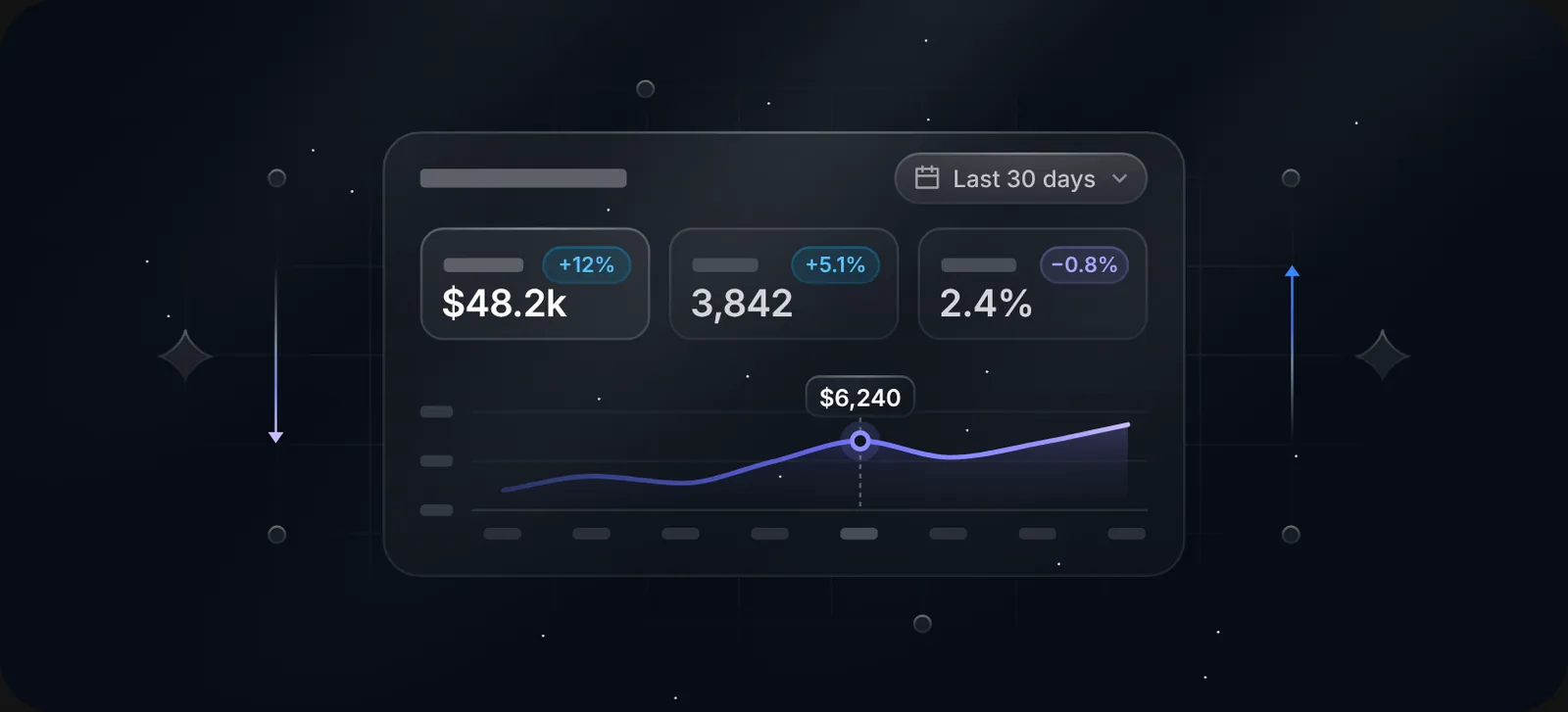
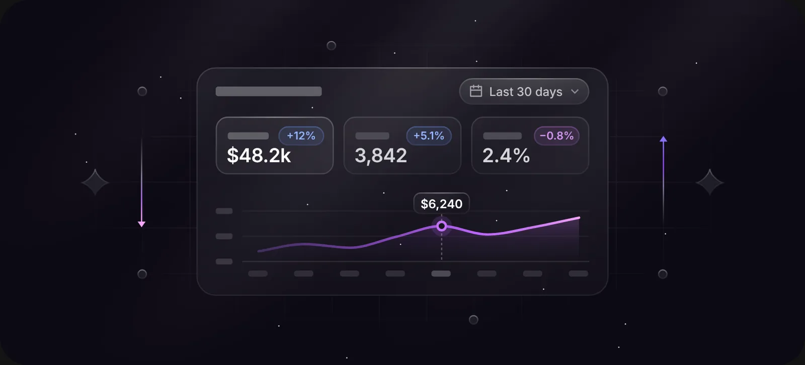
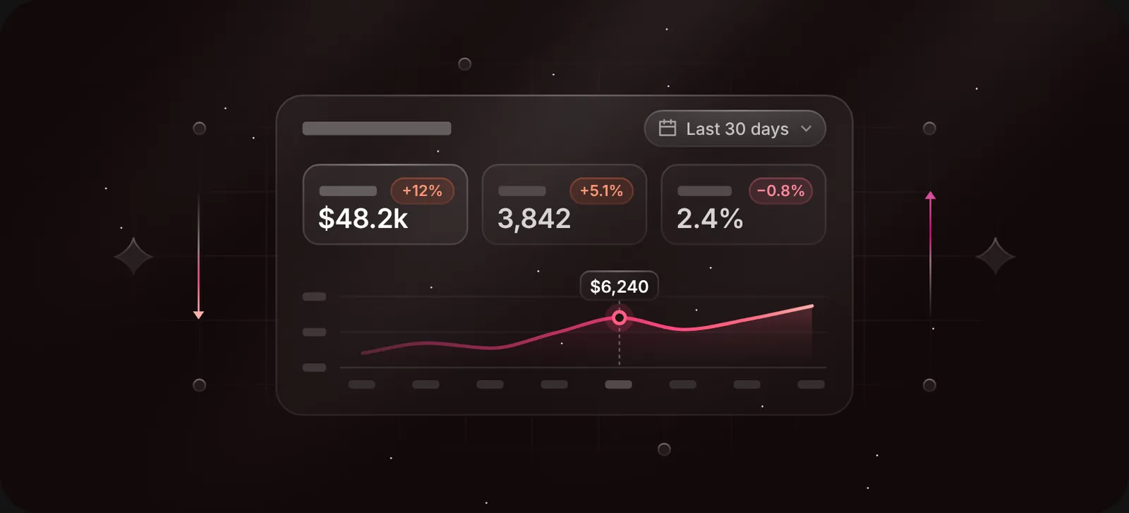
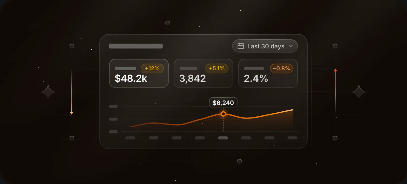
How Duskcover is set up
The Library has 999 scenes in eight groups: Foundations, Forms, Navigation, Feedback, Overlays, Data, Content and Assets. You can search by keyword ("pricing", "upload", "AI") or press Surprise me.
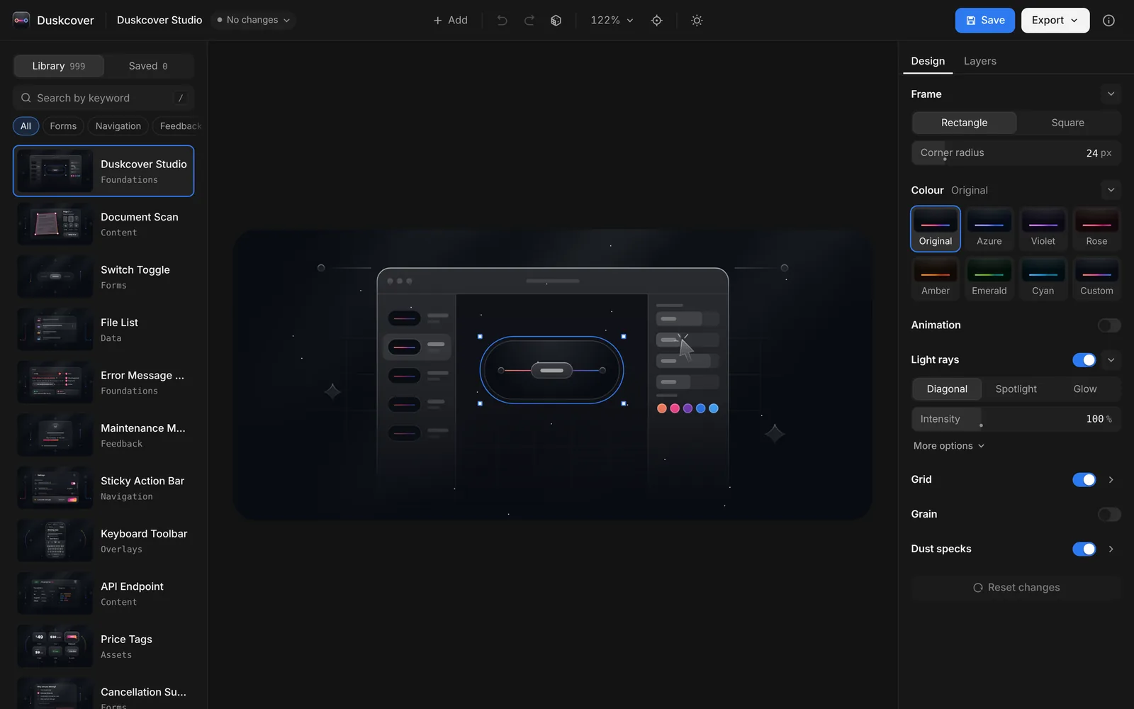
Everything in a scene is editable: move, resize, recolour and retype any element, or switch to the Layers tab. The light rays can be Diagonal, Spotlight or Glow. The frame can be a rectangle with your own corner radius, or a 1:1 square for social posts.
Exports:
- SVG with live, editable text and Inter embedded. The SVG is built to paste into Figma cleanly: shadows stay shadows instead of turning into blurs.
- PNG or WebP at @1x (668 × 304) or @2x (1336 × 608).
- Video: MP4 (WebM where the browser can't encode H.264), animated WebP or animated SVG, one seamless loop.
- Code: copy the SVG, or copy a React (.jsx) component.
Questions people ask
Is there a free unDraw alternative for dark UI? unDraw lets you change one accent colour, but the style stays flat characters on white. For dark interface scenes, Duskcover and Flowbite's dark variants are the closest free options.
What's the "Linear style" exactly? A dark background with a faint grid, one diagonal or top light, UI pieces drawn as frosted glass with 1 px borders, and a single bright accent. Duskcover's light rays, grid and dust specks are each a switch in the Design panel, so you can turn the effect up or down.
Can I use these illustrations on a light website? Yes, as cards. Give them a corner radius and some space around them. They're built for dark, so don't try to invert them.
Can I use Duskcover illustrations commercially? Yes, in your own products and in client work, with no credit required. You can't resell the illustrations themselves as a pack. The details are on the licence page.
 Try Duskcover, freeDuskcover is a free studio for glowing dark UI cover illustrations. Pick from 999, edit text, colours and light, then export SVG, PNG, video or React code.